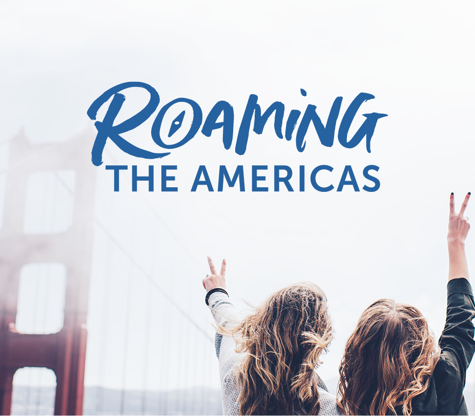
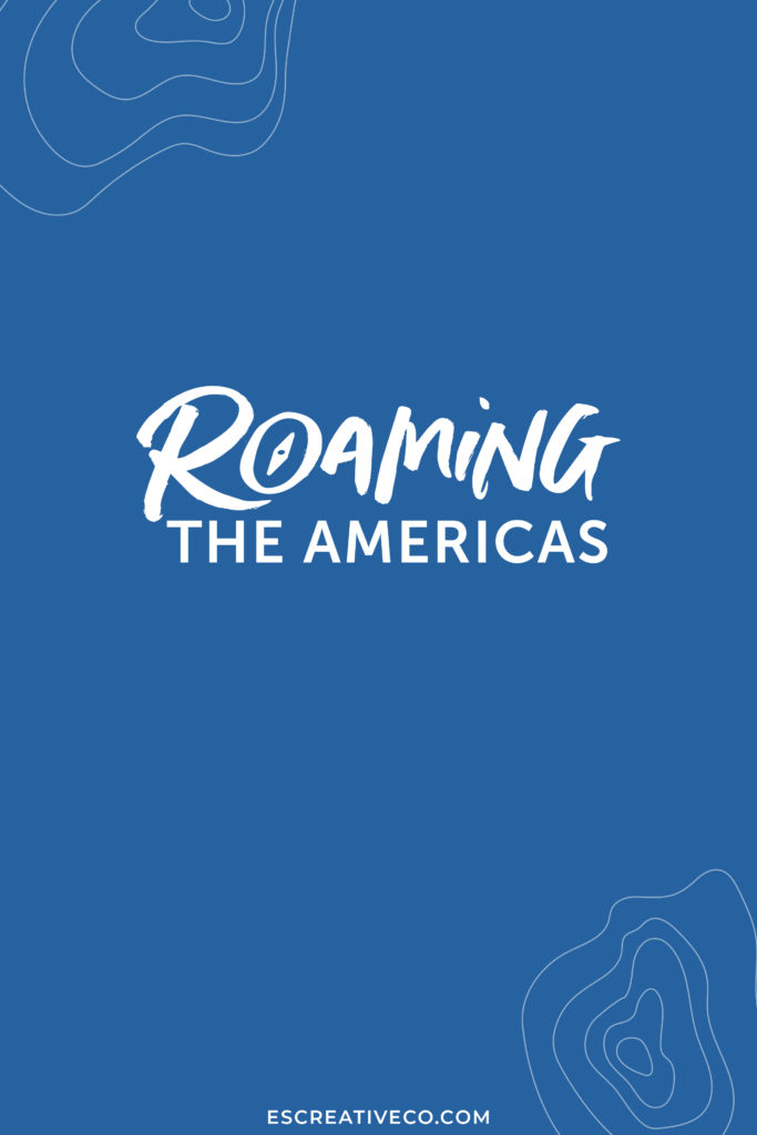
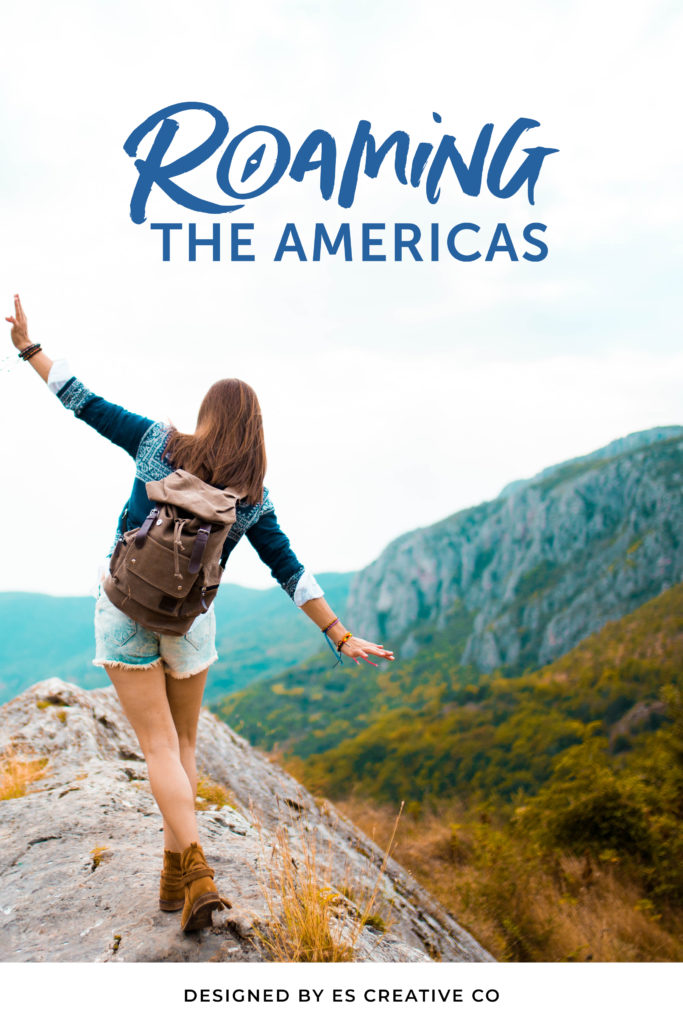
I was so excited when Naomi reached out to me to design a new logo and feel of her travel blog, Roaming the Americas. Naomi had outgrew her previous logo and wanted a brand refresh that spoke more about the personal touch she adds into her blog.
Roaming the Americas is a travel blog that is dedicated to female travelers who are curiosity-driven and love to explore. Naomi provides tips and travel experience suggestions that are kind to the environment, support the local economy, and connect them to the local with culture in a meaningful way.
Naomi founded her travel blog out of her passion for traveling and wanting to help others to get out and explore. She wanted to provide a resource for sustainable travel and outdoor adventure.
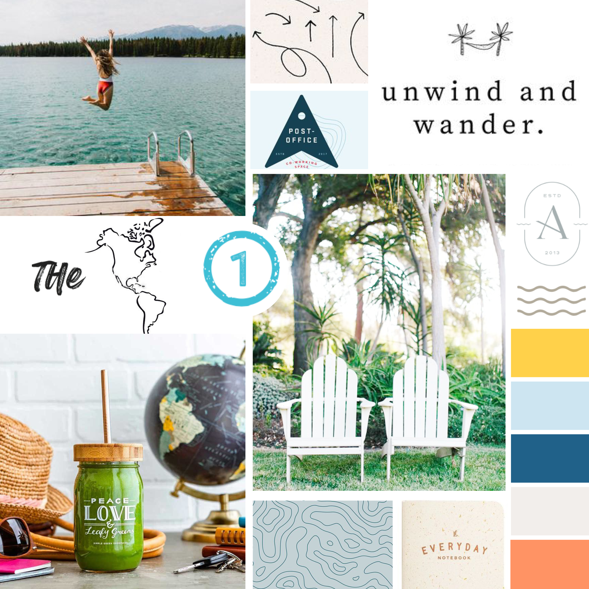
MOOD BOARD
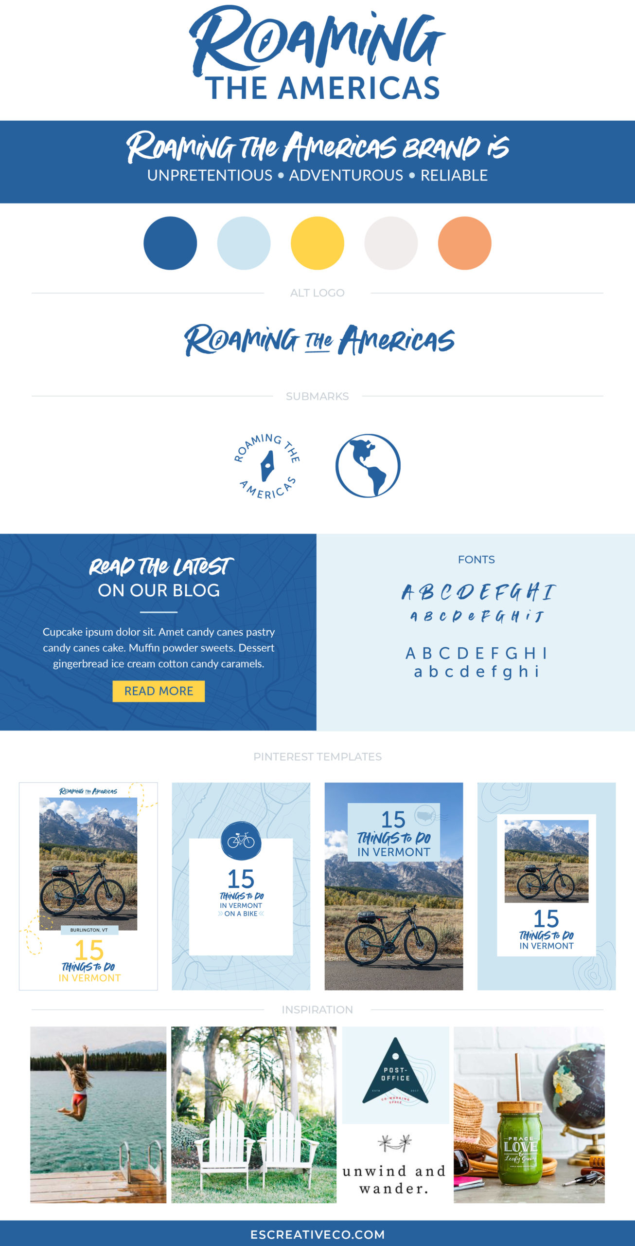
After digging deep and learning as much as I could about Roaming the Americas, it was clear that her brand should have an adventurous, reliable and down-to-earth vibe. To achieve this we needed to create a modern handcrafted brand that had a mix of hand drawn elements. This vibe can be seen in the brand mood board below:
LOGO DESIGN
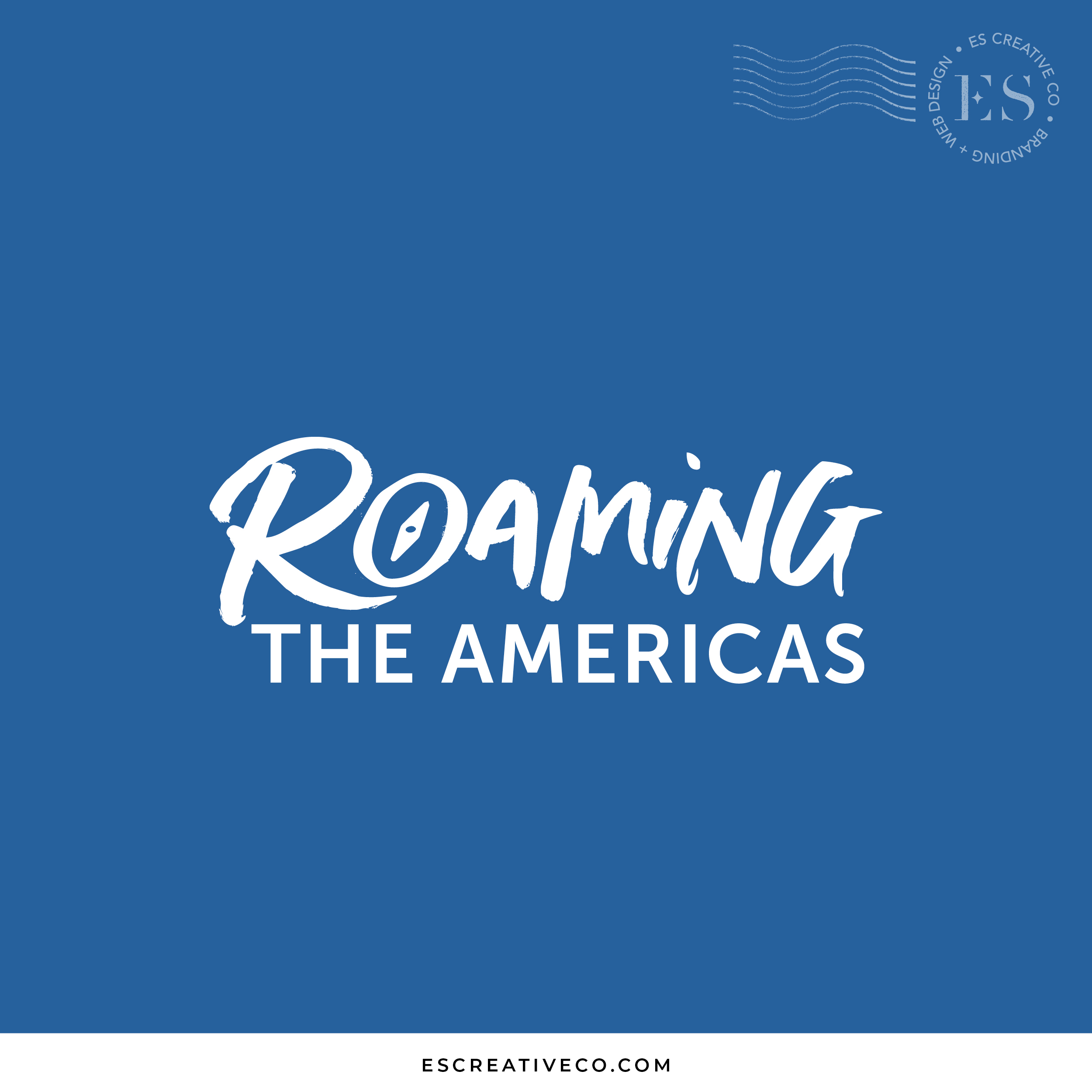
Once we had finalized the overall vibe and feel of her brand refresh, I explored creating logo designs. After a couple rounds of revisions, Naomi fell in love with this logo design that features a compass. It couldn’t be any more perfect for an adventurous travel blogger like herself!
ALT LOGO DESIGN & SUBMARKS
To ensure that her new brand is set up for success, I created a horizontal version of her logo as well as a couple of submarks. These submarks are perfect for her to use for her travel blog’s favicon or to use on her social graphics.
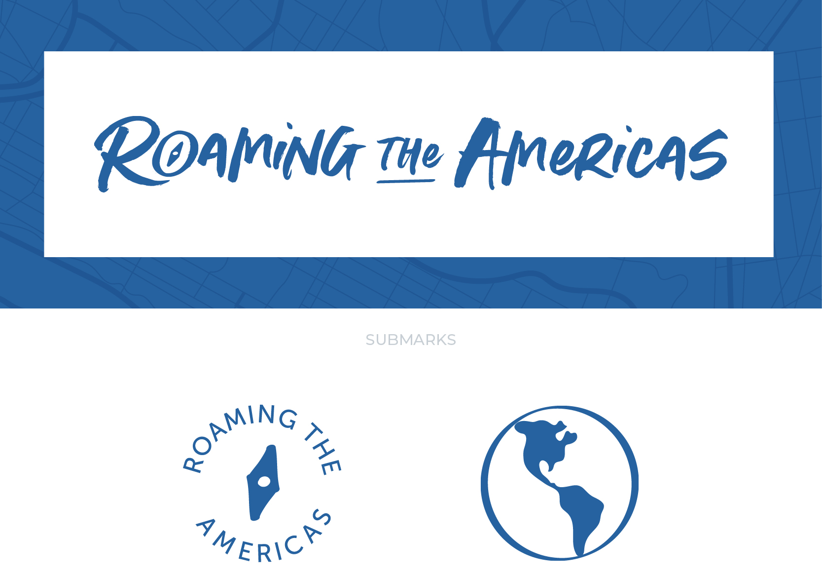
The first submark is a stamp featuring the compass from her main logo. The second submark is a globe featuring the Americas.
BRAND COLOR PALETTE
Naomi wanted her reader to feel like they were reading a reliable source when they were reading her blog. With that in mind, I created a brand color palette of mostly blues mixed with sunshine yellow, tangerine and a sandy gray.

BRAND FONTS
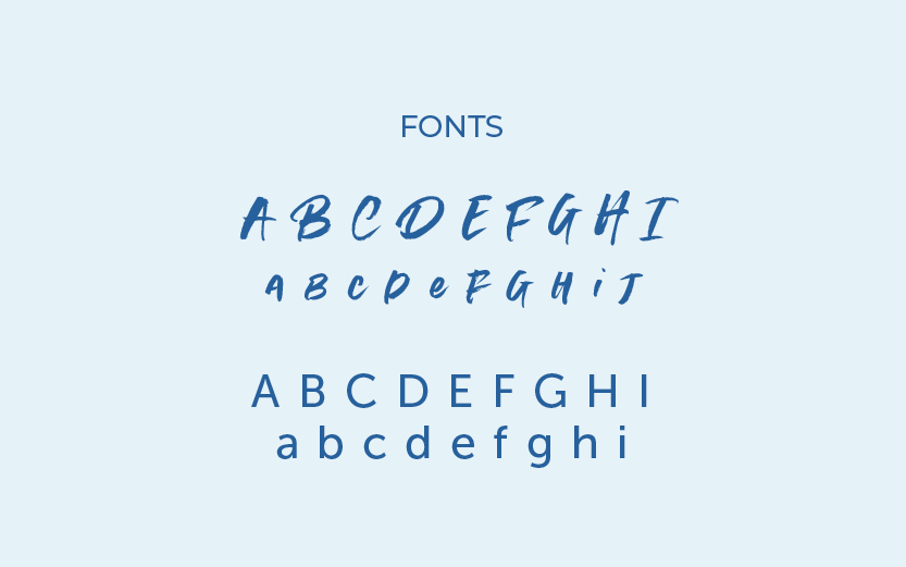
Fonts play a big role in visual branding and are just as important as other brand elements. For Roaming the Americas, I decided to mix a handwritten marker font with a sans serif font to give the brand a down-to-earth vibe.
BRAND PATTERNS
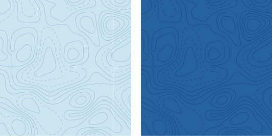
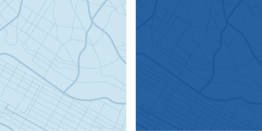
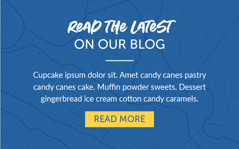
One of my favorite parts of the brand design process is creating custom patterns! Having brand patterns adds depth and consistency to your overall visual branding. To give her brand that adventurous vibe, I created a topographic and street road map patterns.
PINTEREST TEMPLATES
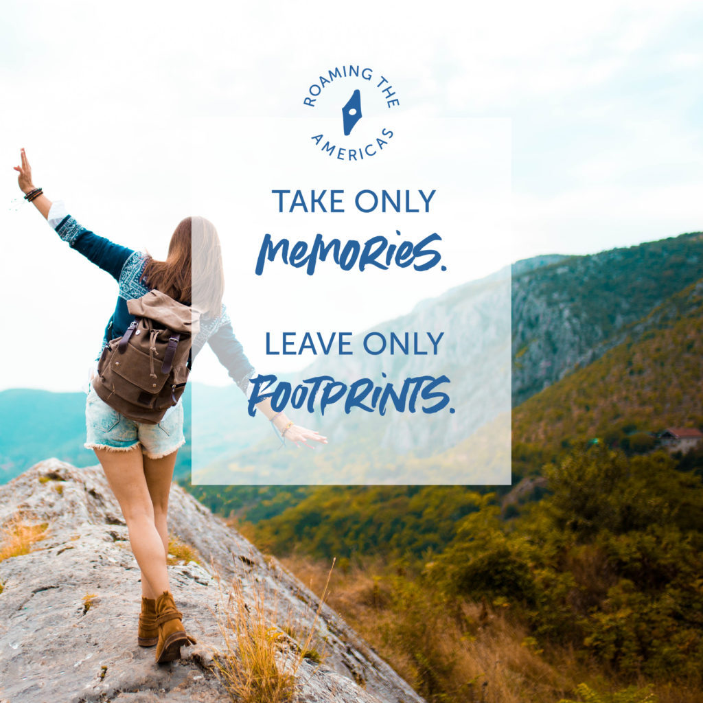
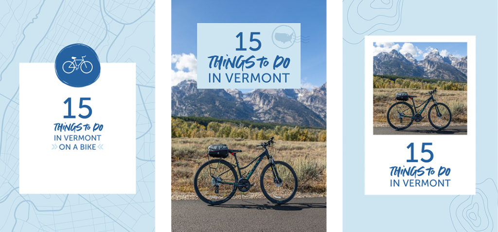
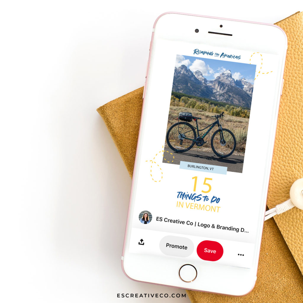
As a travel blogger, it’s crucial to have an engaging social media following. Naomi told me most of her traffic comes from her Pinterest page. I created a variety of fresh pin templates that Naomi would be able to use these templates moving forward to promote new blog posts and travel tips.
BRAND GUIDE
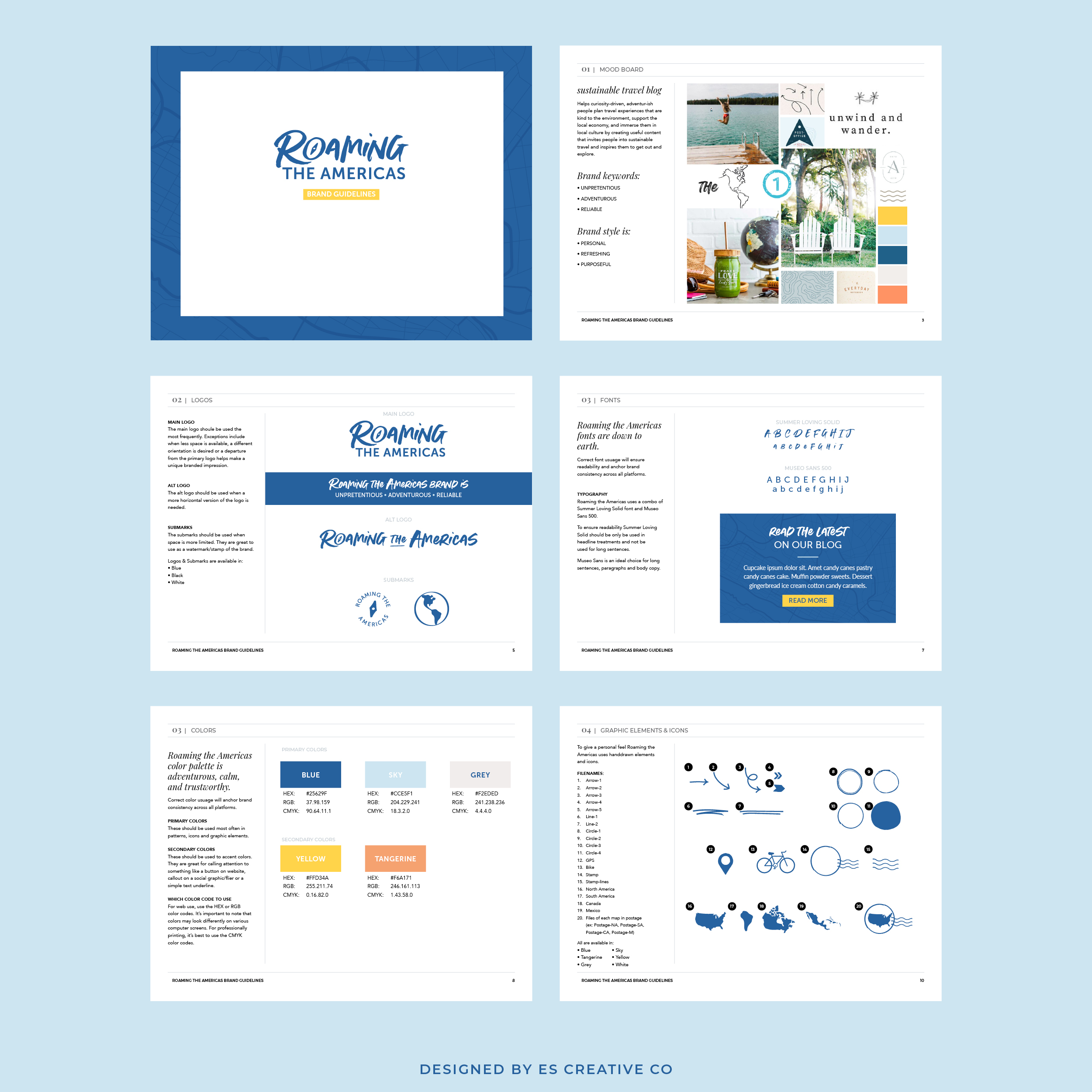
To help keep all her brand assets straight, I created Naomi a set of brand guidelines. This guide is essentially the how to guide for her new brand. That way Naomi knows how to use each part of her brand!
The brand guide covers:
- Her brand goals
- Who her ideal client is
- All of her logo variations (main logo, alt logo and submarks)
- Color Palette
- Fonts Custom
- Graphic Elements and Icons (and how I named each file!)
- Patterns
- Pinterest Templates
Tell me what do you think of this travel blogger logo and branding design refresh!
Want to see other logos and brands that I’ve designed? You can check out my featured projects here.
Are you ready to give your blog a new look with me as your branding tour guide like Naomi did? Then check out my custom logo design & branding package, Luxe Cruiser. This is where I take you on an exciting brand adventure starting with your brand foundation and ends with a logo that attracts your dream clients.
SAVE FOR LATER! PIN THIS:
(Well, that and eating pizza. I’m really good at eating pizza!)
CREATING A BRAND THAT WILL GET YOUR BUSINESS NOTICED IS WHAT I’M BEST AT.
I help boss ladies, like yourself, every step in their branding journey.
I understand that visuals attract, but stories are what convert. That’s why I built a branding process that discovers the heart of your business and story.
I create custom logos and branding so you can feel confident in your biz and get back to the things you love! Let’s be honest, you’ve got a mile long to-do list and creating your logo and branding should be the last thing you stress about!
aka your branding tour guide
I'm Erica
hey there!
instagram
Join my adventures on
