


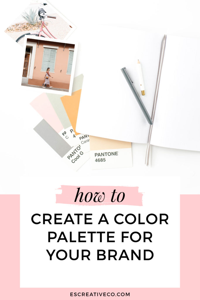
Have you ever changed the colors on your website or social graphics because you were inspired by someone else’s? Or did you pick your brand colors because they were your favorite colors? If you answered yes to any of these then I want you to keep reading. I’m going to get a little nerdy with you and share with you tips to pick your brand colors that will allow you to attract more clients!
When working with my branding clients, I always ask them what colors they have in mind for their brand. Thankfully they usually aren’t sure but have one color they hate and don’t want included. This is music to my ears because our brand colors aren’t about us! It’s about the type of clients we want. We want our clients to feel like we are there just for them.
Let me give you a quick example. Have you ever gone into a store that you knew immediately wasn’t your style? Chances are you didn’t hang out there too long.
The same goes for your branding. You want to attract the right people who WILL work with you.
BEHIND THE SCENES look on HOW I PICK BRAND COLORS FOR MY CLIENTS
Step 1: Do a little brand homework
The first step in my design process is actually having my clients do a little bit of homework. We get clear on who their ideal client is to make sure we are creating a brand that is going to attract those dreamy clients. If you aren’t sure on who your ideal client is, then check out my blog post: 3 Ways to Discover Your Ideal Client
Once we have an understanding of their ideal client, we discover their brand keywords.
Here are some questions that I ask them:
- What are 3 words that describe how you want people to feel when they experience your brand? How would you want someone to describe working with you or your website? Ex: cheeky, confident, fun-loving, knowledgeable
- What are 3 words that describe the overall look & feel of your brand?
What kind of personality do you want your brand to have? Is your brand bright & playful or is it more light & airy? Maybe it’s classic & feminine or is it edgy & modern? Think about how you want someone to describe your brand when they see it.
Step 2: Pick your main brand color
Your main color is your go-to color. It’s going to be the color that you most commonly use for your logo, website, fliers, business cards, social graphics etc. For example, my main color is turquoise. I use it in my logo, in my patterns, in my photos etc.
When picking your main brand color, you do not want to just pick your favorite color! Go back to the keywords that you wrote down in step one. What colors reflect those emotions and feelings? To help you figure out which colors best represent your keywords, here is a chart all about color theory:
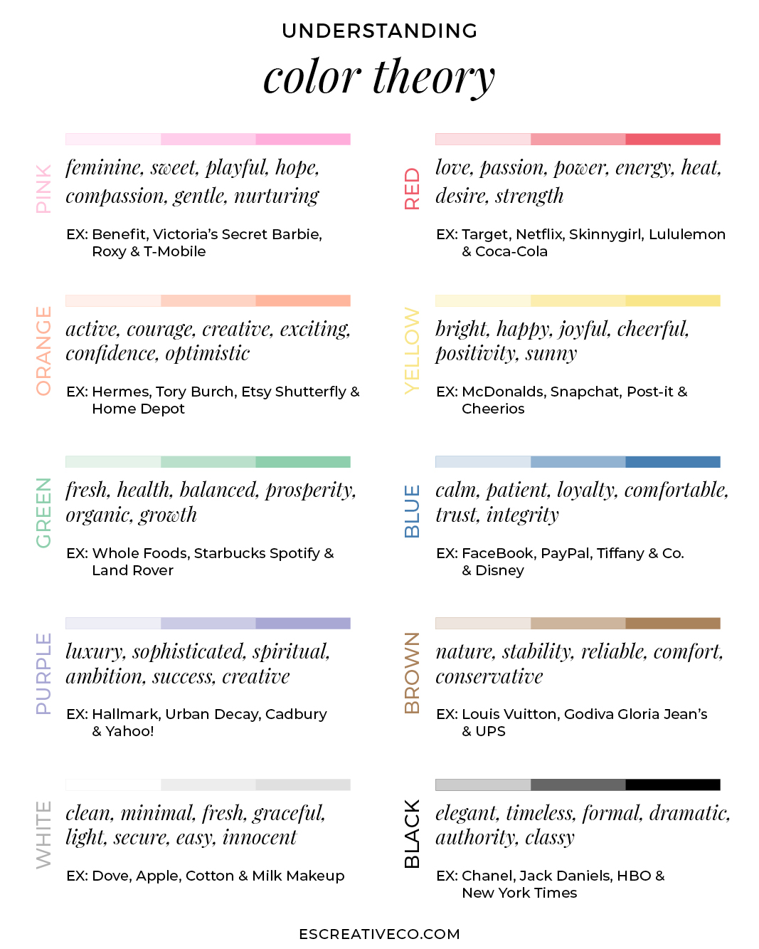
Now that you have an understanding of the psychology behind each of the colors, it’s time figure out your main brand color. Which keyword do you want to best represent your brand? Which color would your ideal client be most attracted to? Asking yourself these questions will help you choose.
Also, don’t forget to think about the shade of that color! Let’s say your main color is blue because your brand is knowledgeable. But there are a million different shades of blue! You could pick a navy that is a little more professional or you could pick a sky blue that is a little more relaxed.
Step 3: Gather inspiration for your brand
Once you have figured out these questions, then it’s time to have fun on Pinterest by creating an inspiration board. Inspiration boards are great to create a visual of what you want your brand to look like. I like to start by searching the brand keywords that my client has answered in Step 1 along with activities that are relevant to their business.
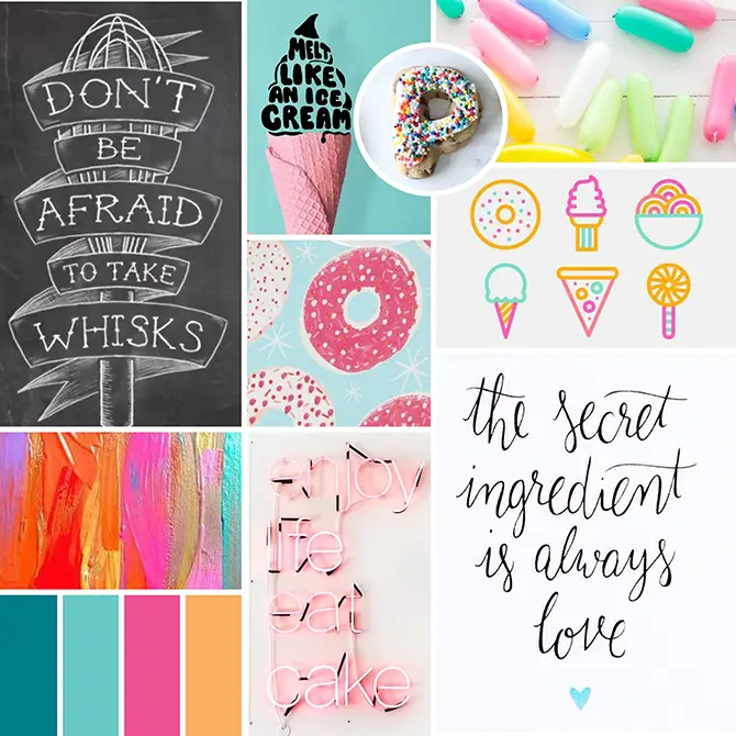
Below is an example that I created for my baker client, Make it Laine. The keywords for her brand were playful, young, whimsical, fun and creative. I pulled inspiration that reflected those keywords, as well as things related to baking – sprinkles, utensils, and sweet treats.
You can see all the inspiration on the Pinterest Board I created here.
Step 4: Pick your color palette
Now that you have your main color and inspiration completed, it’s time to determine the other colors in your palette. You don’t want to go too crazy with your brand colors because remember we want our brand to stick in our clients mind. If you are DIYing your brand, I suggest picking 3-5 colors. This allows you to have a cohesive brand and allows you to easily know which color to use when you are trying to call attention to something. Here is a quick formula of the colors for you:
1 main color + 1-2 secondary colors + 1-2 accent colors
HOW TO FIND YOUR BRAND COLORS:
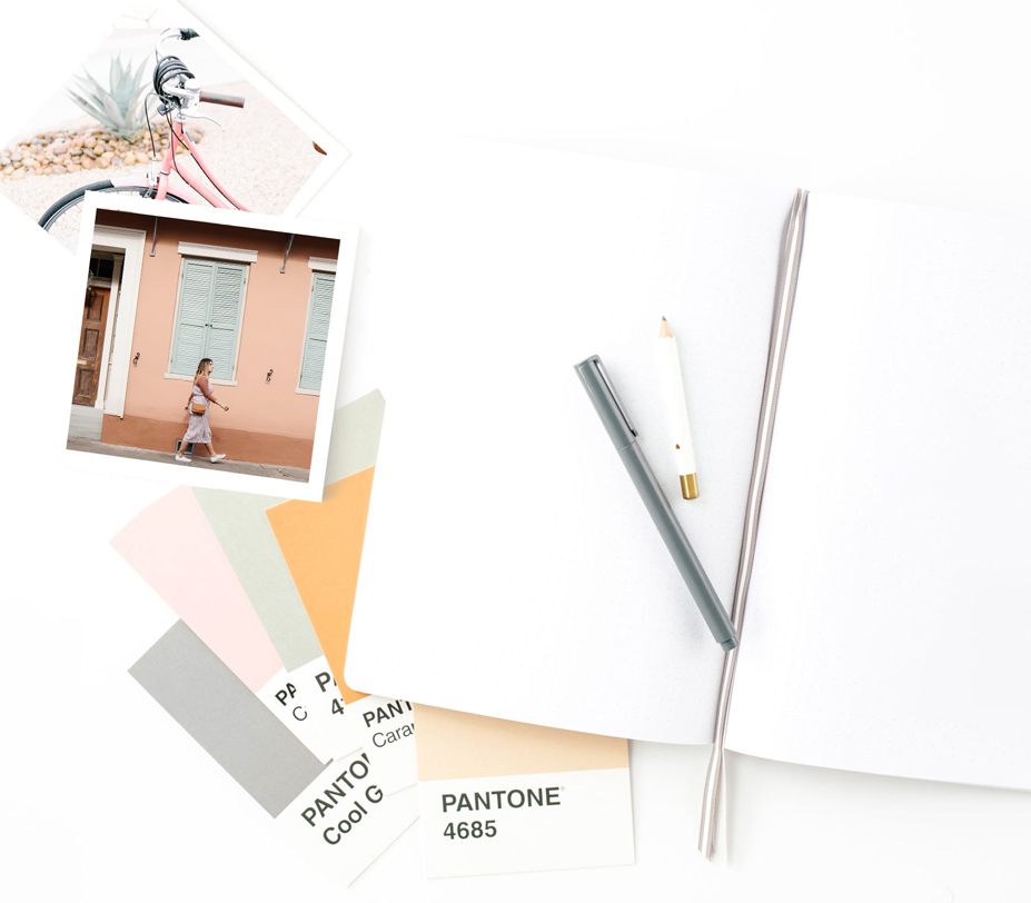
Go back to your Pinterest inspiration. Pick 1-3 images that have your main color in them and represent your brand. Download those images to your computer. Once you have them downloaded, you are ready to figure out the rest of your colors!
Here are 2 foolproof ways you can find your brand colors:
- Upload an image that you pinned to Canva Color Palette Generator. Canva will automatically populate a color palette based on that image.
- This one is my favorite! Upload a photo you found on Pinterest to Adobe Color Palette
Once you upload your photo, it pulls the color palette for you. You can adjust on the left hand side to a more colorful, bright, muted, deep or dark palette.
If you want to adjust a single color then you click on the color wheel in the top left and can adjust the colors.
Copy the color codes you select and go ahead and create a color palette using those colors.
Step 5: Put your brand colors to the test!
Once you have your palette figured out, it’s time to put it to the test!
- Do my brand colors compliment each other or do they blend too much together? If they are blending too much together, then you need to adjust them.
- Do these colors represent the personality I want people to feel when working with me?
- Will my ideal client like these colors or will she wonder “what was she thinking?!?”
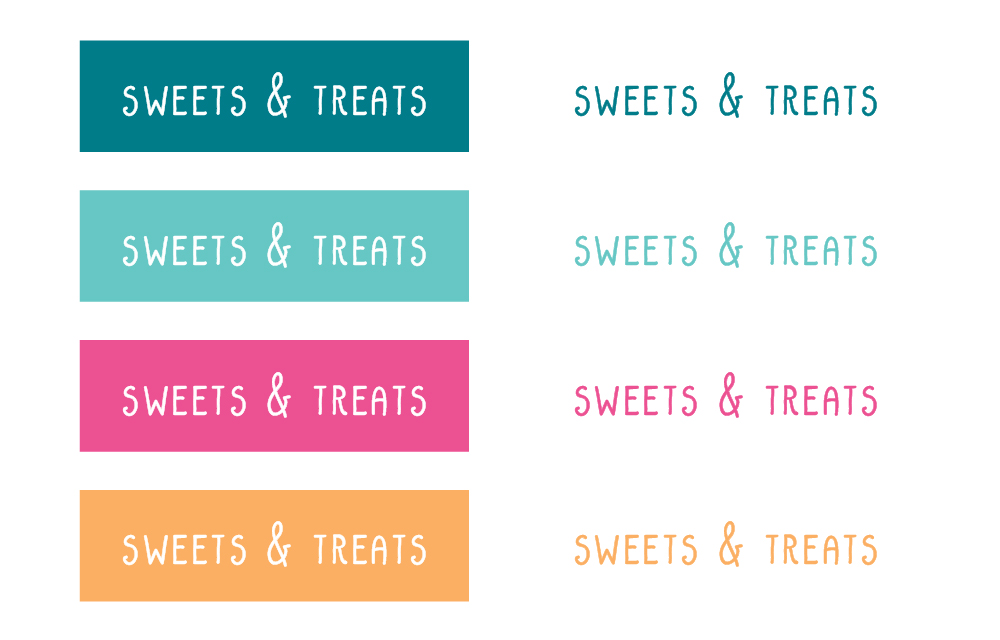
If you are a visual person like me, you may need to test drive your colors. Open up your favorite design program and simply create fake buttons (aka rectangles with text on top) and headlines in your brand colors. Double check that your colors that you can easily read the text. Below is an example for Make it Laine’s brand.
Congrats! You created your brand color palette!
Now it’s time to start using those colors in your website, social graphics and marketing. Once you start using them, you will instantly start creating brand consistency and recognition.
Would you rather not do all this on your own? Don’t worry, friend! As a brand designer, I’m extremely passionate about helping you find colors that truly fit your brand. Learn more about how we can work together to develop a solid brand identity for your creative business today!
SAVE FOR LATER! PIN THIS:


(Well, that and eating pizza. I’m really good at eating pizza!)
CREATING A BRAND THAT WILL GET YOUR BUSINESS NOTICED IS WHAT I’M BEST AT.
I help boss ladies, like yourself, every step in their branding journey.
I understand that visuals attract, but stories are what convert. That’s why I built a branding process that discovers the heart of your business and story.
I create custom logos and branding so you can feel confident in your biz and get back to the things you love! Let’s be honest, you’ve got a mile long to-do list and creating your logo and branding should be the last thing you stress about!
aka your branding tour guide

I'm Erica
hey there!
instagram
Join my adventures on
