The first impression of your brand starts with your logo. Think about it. It’s the thing that is most commonly used in all of your branding and marketing. Your logo is placed on your web site, your social media covers, letterhead, opt-ins, business cards – I think you catch my gist.
You know that you need one. You can either:
- DIY it.
- Buy a premade one
- Hire a professional designer
Obviously, I am biased to think everyone should hire a professional designer, but when you are first starting out I get it, it might not be an option. But that doesn’t mean you deserve a bad logo (YES! There is such a thing as a bad logo!).
Quick, think of 3 popular brands. Now visualize their logo design.
Chances are you picked a brand with a one word name and a simplistic logo. (Such as: Target, Apple, Nike, Dove etc.)
Now don’t get me wrong, I’m not saying that to have a successful business you need a one word name and simplistic logo. I just want you to understand the importance that having a simple and easy logo is the most effective and memorable.
Makes sense! I don’t know about you but my days are filled with chasing Samantha around, talking our dog for a walk, working out, errands, cleaning the house, planning what’s for dinner, and planning teaching activities with Samantha. That’s not even including what I need to do for my business!
If your logo is too busy, complex or misleading it’s not going to stick in your potential client’s mind.
Whether we like it or not, first impressions matter the most. Your logo is the key component of that first impression. Want to make the best first impression? Let me walk you through the mistakes your logo could be making.
5 MISTAKES YOUR LOGO COULD BE MAKING
1. Your logo design is hard to read
It seems like a no-brainer but this is the number one common mistake I see! Sometimes the logo uses a script font and it’s difficult to tell letters apart. Don’t get me wrong. Pretty script fonts and calligraphy can make for some really gorgeous logos. But if the lettering is too hard to read, then your logo isn’t doing it’s job. Take the look at my pretend logo example below. Can you quickly read it?

Now, take a step back. Can you still read it? If you guess Den 8 Parker, you are wrong! It’s Jen S Darker.
Or sometimes the logo is set in white on a soft pink background. Seems pretty right? But can you quickly read the example below? What about from a couple feet away from your screen? You need to make sure your logo doesn’t get lost because of the colors.

Bonus tip time!!! To test your own logo, I want you to ask either your sister, friend, husband or even your mom if they can read it. If they can’t, then it’s likely a lot of people aren’t able to read it clearly right away.
2. Your logo design is too boring or too complex
Remember that your potential client has a mile long to-do list and is thinking about the next thing on her plate. You need your logo to make a big punch. Meaning you need your logo to grab her attention quickly and STAY there just like those big brands you listed off.
By including a graphic element that reflects your business, your logo is more likely to make an impact than a logo that is just all text. On the flip side, if you have too many icons or is too complex then it will not scale down and be easily read by your client.
My fake bad example has a pretty floral illustration that plays off the last name. However, it makes it difficult to read. When the logo is reduced for business card size or website viewed on a phone, it will be become really difficult to read. It would be better to simplify the flowers and not use them in the background of the logo.
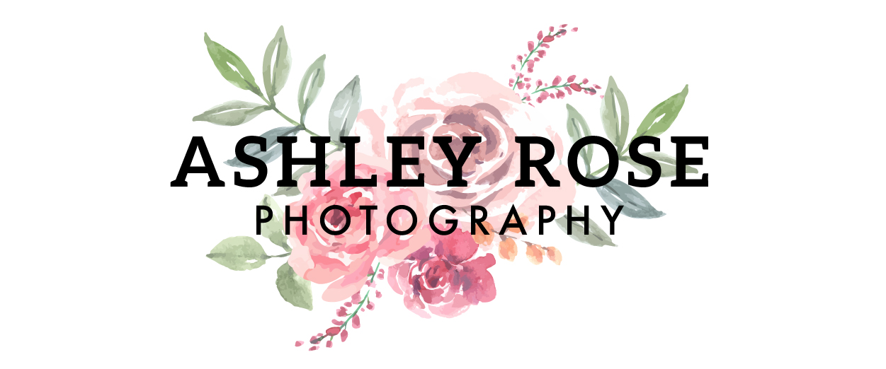
3. Your logo design is irrelevant to your business.
Another common mistake that I see in logos is that there is an icon that has nothing to do with the business. It might be tempting to have some deep story behind the logo but then it’s just going to seem like off. Think of it this way. Have you ever stumbled into a modern exhibit at an art museum? You probably are completely puzzled by how a painting that looks like your child made is hanging on the walls. Am I right? Well using an icon that makes no sense to your clients is the same thing.
My fake bad example below for a beauty bar uses a dog in the logo. Based on the name of the salon, there’s no logical reason for the dog to be in the design. The potential client might be confused if the beauty bar is for herself or her beloved pup.
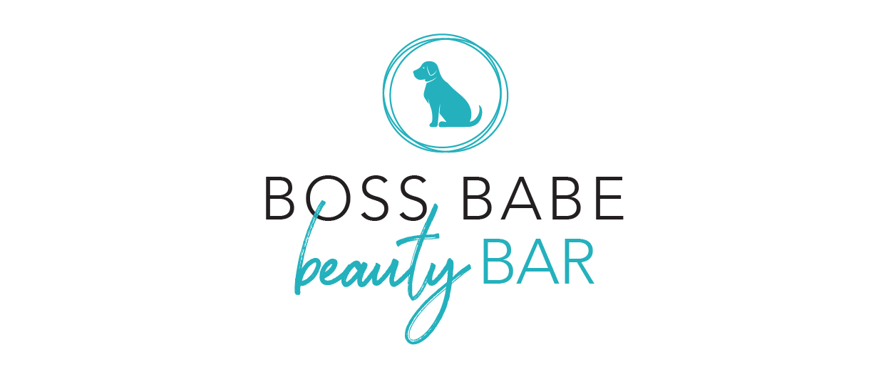
4. Your logo design is too trendy
Being on trend seems like a great idea, but in reality, it’s a bad idea! What happens when 5 others in your field start using similar logos? How are you going to stand out? Also, trends come and go, right? Your logo shouldn’t be part of a trend that’s going to look dated in just a matter of months.

5. Your logo design uses too many fonts
When it comes to logo design, simple is best. Using 3 or more fonts usually makes the logo seem unprofessional, confusing, busy and complicated. There’s no need! Instead, I recommend sticking to no more than 2 fonts in your logo design.

5 LOGO MISTAKES THAT ARE DAMAGING YOUR BRAND
Just to recap, here are my top 5 logo mistakes I see from creative solopreneurs:
- Illegible Logo Design
- Boring or Over Complicated Logo Design
- Irrelevant Logo Design
- Trendy Logo Design
- Too Many Fonts Used In Logo Design
Are you making one or more of these logo design mistakes?
If so, then let’s chat on how you fix it! CLICK HERE for your free consult.
And don’t forget to download my free workbook — 4 Easy Steps to Creating a Memorable Brand — a 12 page guide to help you take your brand to the next level.
SAVE FOR LATER! PIN THIS:
(Well, that and eating pizza. I’m really good at eating pizza!)
CREATING A BRAND THAT WILL GET YOUR BUSINESS NOTICED IS WHAT I’M BEST AT.
I help boss ladies, like yourself, every step in their branding journey.
I understand that visuals attract, but stories are what convert. That’s why I built a branding process that discovers the heart of your business and story.
I create custom logos and branding so you can feel confident in your biz and get back to the things you love! Let’s be honest, you’ve got a mile long to-do list and creating your logo and branding should be the last thing you stress about!
aka your branding tour guide
I'm Erica
hey there!
instagram
Join my adventures on
