


One of the first steps I do when working with my branding clients is picking the perfect set of fonts for their business. Being the font nerd that I am, I LOVE this step! I can’t tell you how many years I have spent scrolling through pages of different fonts. The perfect font pairing can really set the tone for a brand. Fonts play a big role in your branding. They set the overall vibe of what it is like to work with you. If you pick the wrong fonts, your brand can appear not only unprofessional, but also misleading.
Of course you want your brand fonts to look good together, but they also need to reflect your brand’s personality. If your business is professional, you wouldn’t want to use a playful script font because that would give off the wrong vibe.
If you are not sure on your brand personality, then download my FREE brand guide! In my 4 Easy Steps To Creating A Memorable Brand workbook, you will learn step by step how to create a brand that attracts your ideal client.
I know picking brand fonts can seem as daunting as finding a matching pair of socks in your clean laundry pile. But with my tips, you will have clarity on how to pair your brand fonts to ensure your brand looks professional.
5 font pairing tips for creative entrepreneurs who are designing their own brand
1. Stick to two-three fonts to use within your brand
The goal of font pairing is to choose fonts (usually 2-3 at the maximum) that work harmoniously together.
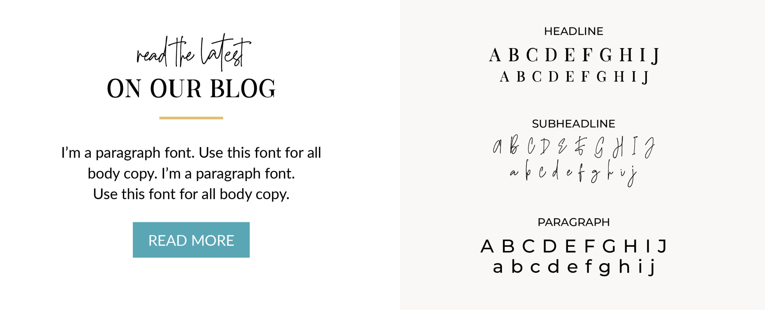
When picking fonts for your business, you want to stick to two main fonts. These two main fonts are what you will be using for headlines and subheadlines. Occasionally a brand may use a third font as an accent font, but if you are non-designer then the simpler is always better!
Once you have those fonts picked out, you will want to assign them a role. This will help you keep your brand fonts straight! You will know how to use them and be able to create your social graphics, opt-ins, fliers, etc. a heck of lot faster!
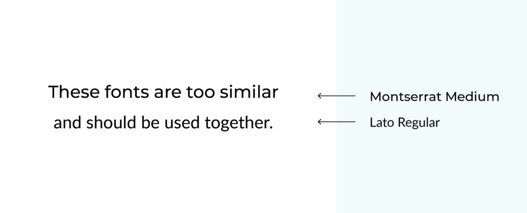
2. Don’t use two fonts that are too similar to each other
One of the biggest mistakes I see is when solopreneurs pick two fonts that are very similar to each other. They think because they are similar then they pair well together. However, this is not the case. Most of the time the average viewer can not tell the difference between the two fonts. Or worse! They will look so similar that it almost looks like a mistake!
The best way I can describe this, imagine you are quickly packing for a trip. You grab a pair of your black heels in your closet because they will go with a couple of the dresses you have packed. But you are in such a hurry and instead of grabbing your little black dress to match your black heels, you pack your dark navy dress. Sure in a dimly lit room no one will notice. But you can’t help but be bothered by it. The same feeling happens when you pick too similar fonts! The best thing to do is to avoid pairing similar fonts altogether.
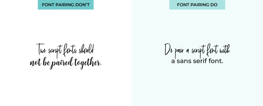
3. Don’t use two scripts or handwritten fonts together
One of my favorite font styles is a script and handwritten! I can spend hours searching for the perfect font in these two styles. Each one has its own personality that can set the tone for a brand. For example, some script fonts can give an elegant vibe, others can give a personal vibe, while others can be playful. Picking the right handwritten or script font can really make or break a brand.
Although I love script and handwritten fonts, they should not be paired together. When paired together they start to compete with each other. Your viewer can not tell what is more important to read. For example, if you used two different script fonts on your website for your headline and subheadline, the viewer would leave your website confused. They wouldn’t be able to quickly read your message.
Remember, there can only be one main star in a show, let your script or handwritten font be that star. Instead of trying to pair them together, try pairing that script or handwritten font with a sans serif or serif font. This will instantly give your brand a more polished and balanced look.
For example, if you found a hand lettered script font that you love! Pair that with a sans serif font. This is going to give your brand an instant modern, classic feel. Try different weights between the two fonts to see which one fits nicely. It’s best if one of them stands out more than the other so they are not competing for attention. Don’t forget, some script fonts can be thin. Make sure that your sans serif font isn’t overpowering your script!
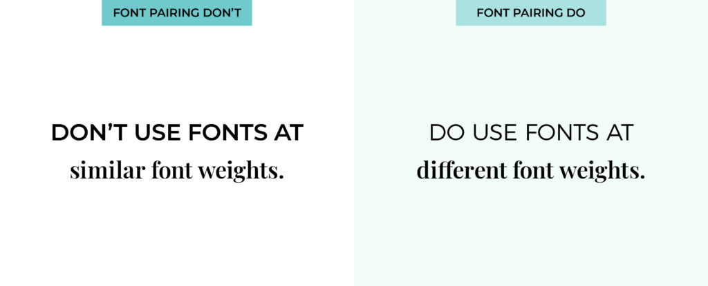
4. Don’t give every brand font the same weight
When picking your brand fonts you want to create some visual hierarchy. One way to do this is by the font weights. Some fonts are naturally more bold or thin than others. Picking fonts with a bit of contrast, will make your brand feel more balanced.
Ok this never fails! Every time I fly my ears pop! Sure enough, I get off the plane and try to have a conversation with my husband. But I never can tell if I am talking normally or if I am shouting … He likes to remind me that I am always shouting when I get off a plane! If he was to just respond to me in as loud of a voice, I wouldn’t get the hint that I was talking so loudly. Instead he always tells me, “Ugh! You are shouting again!”

Using fonts that have different weights will ensure that your brand is not trying to shout!
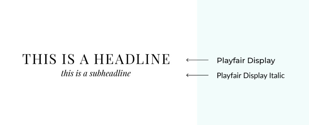
5. Use the same font in different styles and weights
Want a simple and easy font pairing? Use the same font in different weights or styles. For example, almost all fonts can be used in bold, regular, and italic. Some fonts even come in condensed versions. You could have your headlines that have the letters more spaced out and pair that with a condensed version of that font for the subheadlines. There are even some fonts that have a serif and sans serif version! Play around with one font first, it might be all you need for your logo or brand!
If you need a little more, check out my blog post: How To Pick Your Brand Fonts (like a pro!)
Looking for more help in DIYing your brand?
If you want more help in creating your brand, then make sure you download my free guide, 4 Easy Steps To Creating A Memorable Brand. It helps you create a powerful brand that will attract the clients you dream of working with. Consider it your branding blueprint!
SAVE FOR LATER! PIN THIS:


(Well, that and eating pizza. I’m really good at eating pizza!)
CREATING A BRAND THAT WILL GET YOUR BUSINESS NOTICED IS WHAT I’M BEST AT.
I help boss ladies, like yourself, every step in their branding journey.
I understand that visuals attract, but stories are what convert. That’s why I built a branding process that discovers the heart of your business and story.
I create custom logos and branding so you can feel confident in your biz and get back to the things you love! Let’s be honest, you’ve got a mile long to-do list and creating your logo and branding should be the last thing you stress about!
aka your branding tour guide

I'm Erica
hey there!
instagram
Join my adventures on
