It goes without saying that your logo is an important piece of your visual brand identity. I often get asked by my clients, why do they need more than just one logo? Simply put because a single logo just isn’t gonna cut it! To create a one-of-a-kind, cohesive, and streamlined brand you need more than one logo to represent your business.
I tell them, look in your closet. How many pairs of jeans do you own? You have pair that looks super cute with booties. A pair you can only wear with tall boots. A pair that are too long that they require super tall wedges. A pair that you wear with anything navy. A pair that you only rock with sneakers, and I haven’t even gotten to the stack that you hope to fit back into someday. Sure they are all jeans and no one but you can tell the difference but you still only wear them with certain outfits. You need the same logo system in your business! You can say that having more than one logo is almost like having a pair of jeans for every occasion!
By having multiple variations of your logo allows you to be set for success! Think about it for a second. You need a logo for your website, business card, social graphics, opt-in, and any other type of marketing you are doing. If you wanted to get pens made to hand out with your logo on it, you most likely are not going to be able to use the same logo that you have on your website. It will not scale and be able to be read easily.
This is why I create a main logo, an alternate logo, and a submark for all my amazing clients! These multiple versions are necessary so I thought I would break everything down for you like I do for my clients.
Different types of logos
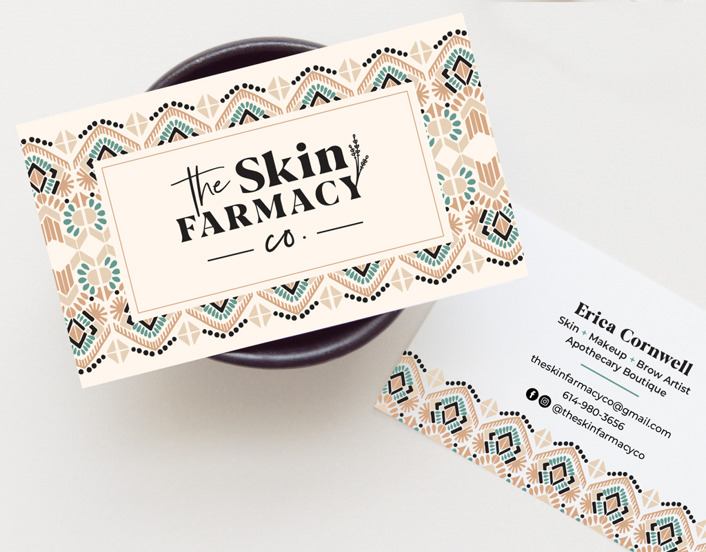
Main Logo
This is your go-to. This is going to be used most often and placed generally at the top of your website, on collateral like your business cards and important business items.
Main logo example
Alternate Logo
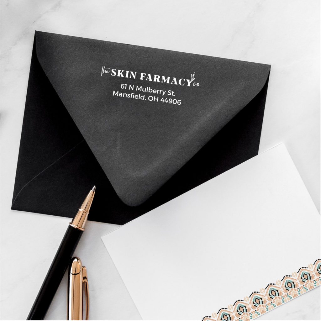
Your main logo may be your go-to but occasionally you may run into a situation where it doesn’t fit quite right. Let’s say you need your logo printed on an envelope return address label. You might need a less detailed version so it can scale small and still be legible. Or perhaps your logo is horizontal but you’re going to use a sticker that requires something more vertical. Whatever it is, I’ve got you covered!
Alternate Logo Example
Submark Logo
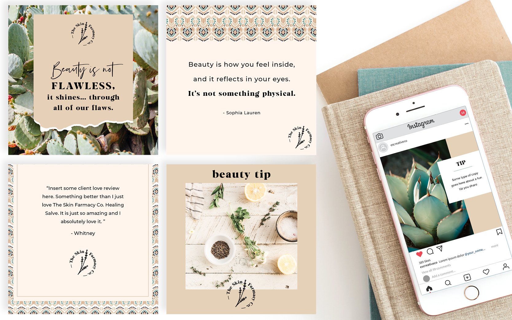
This version is the simplest version of your logo. It is a quick read or what I like to refer to as your brand’s nickname. This version is perfect to use for a watermark, website footer, or favicon (the little icon that sits next to your website URL). It also works great for extra brand collateral like stationery, social posts, presentation folders, cards, etc. This logo is small but has a big punch!
Submark Logo Example
WHAT THIS ALL MEANS:
I think it is important to give my clients a brand that will check all the boxes by the end of our project. I include all the logos mentioned above in color variations. I provide their logos in their main colors, all black and all white so they are ready to display their logo on a website, social graphics, stationery, sign, t-shirt, pen, business card, etc. – the sky’s the limit!
Does your brand have a main logo, alternate logo and a submark? If not, it’s time to consider a rebrand! CLICK HERE to talk about your new brand.
SAVE FOR LATER! PIN THIS:
(Well, that and eating pizza. I’m really good at eating pizza!)
CREATING A BRAND THAT WILL GET YOUR BUSINESS NOTICED IS WHAT I’M BEST AT.
I help boss ladies, like yourself, every step in their branding journey.
I understand that visuals attract, but stories are what convert. That’s why I built a branding process that discovers the heart of your business and story.
I create custom logos and branding so you can feel confident in your biz and get back to the things you love! Let’s be honest, you’ve got a mile long to-do list and creating your logo and branding should be the last thing you stress about!
aka your branding tour guide
I'm Erica
hey there!
instagram
Join my adventures on
